
Fawkes Distillery
Project Type
Logo Design, Brand Development, Packaging Design
Role
Design
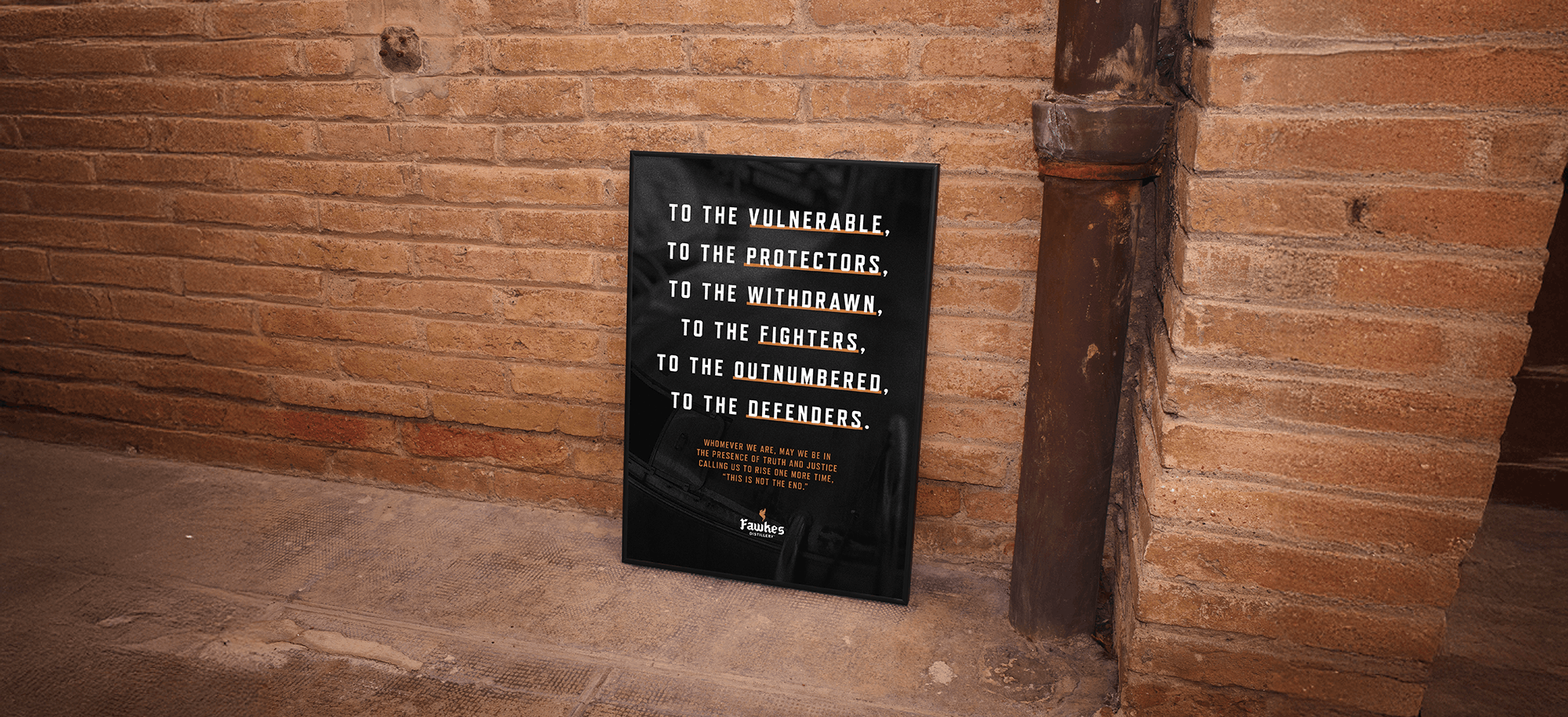
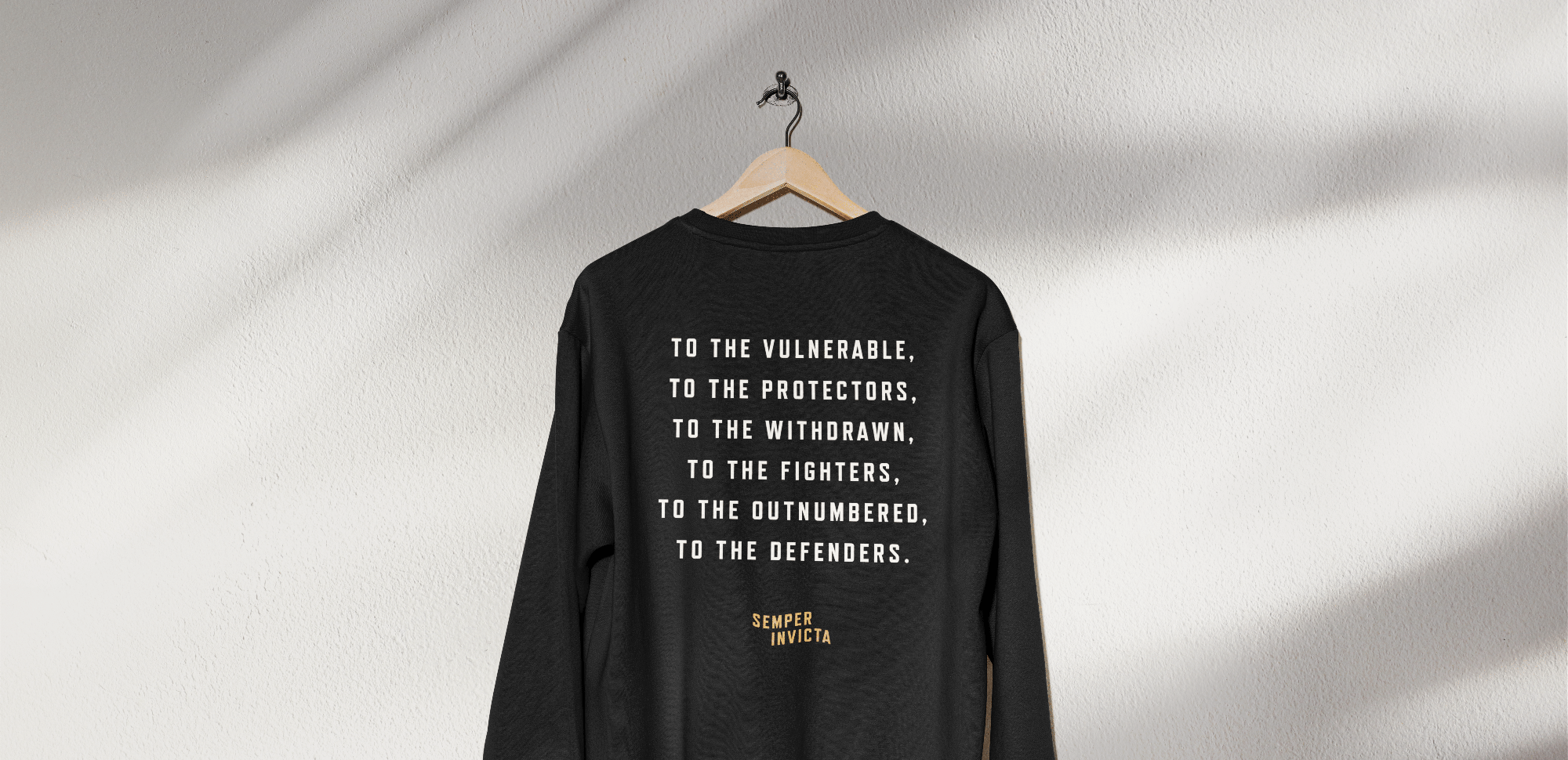
To the vulnerable, to the protectors, to the withdrawn, to the fighters, to the outnumbered, to the defenders. Whomever we are, may we be in the presence of truth and justice calling us to rise one more time, “this is not the end.”
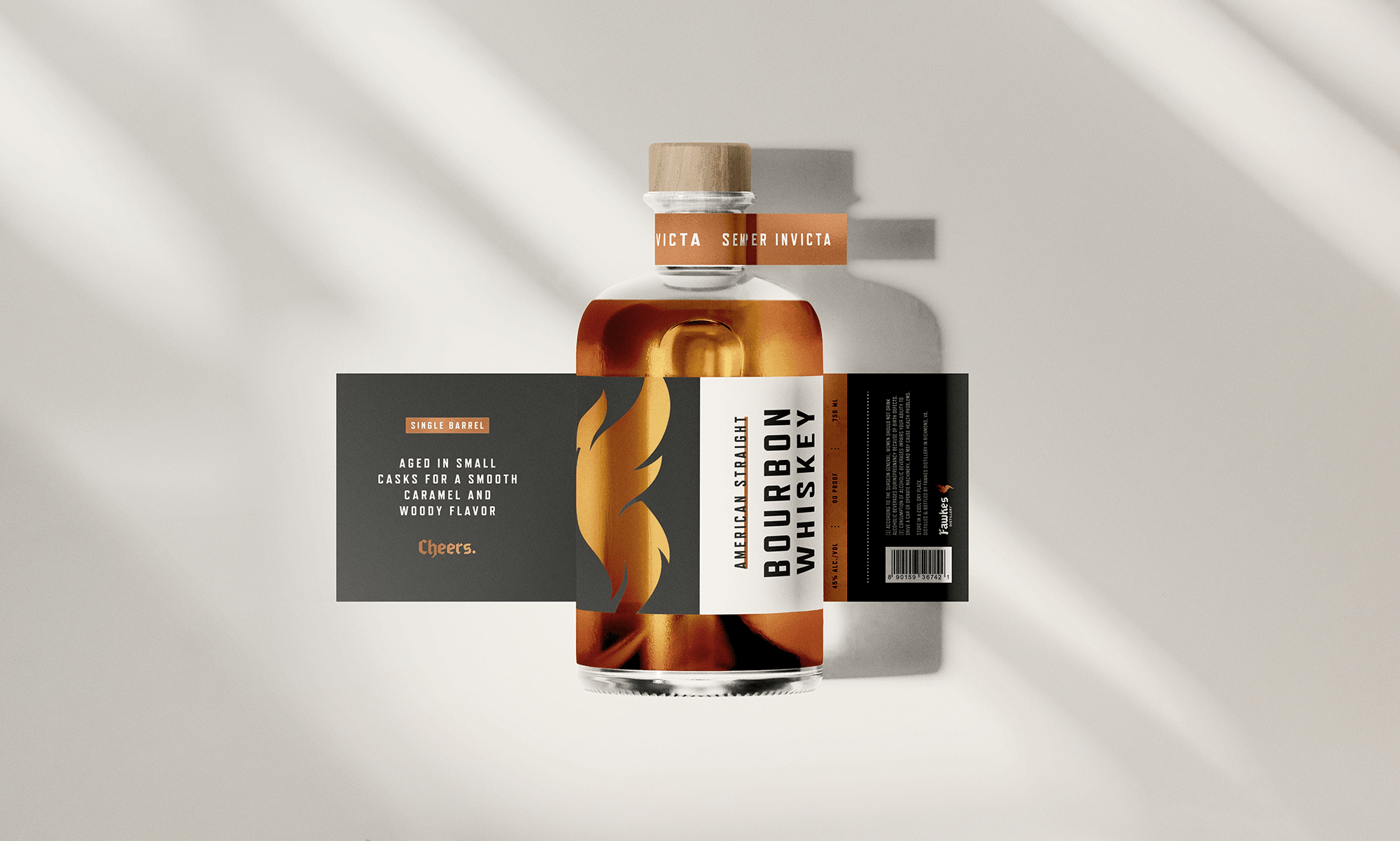
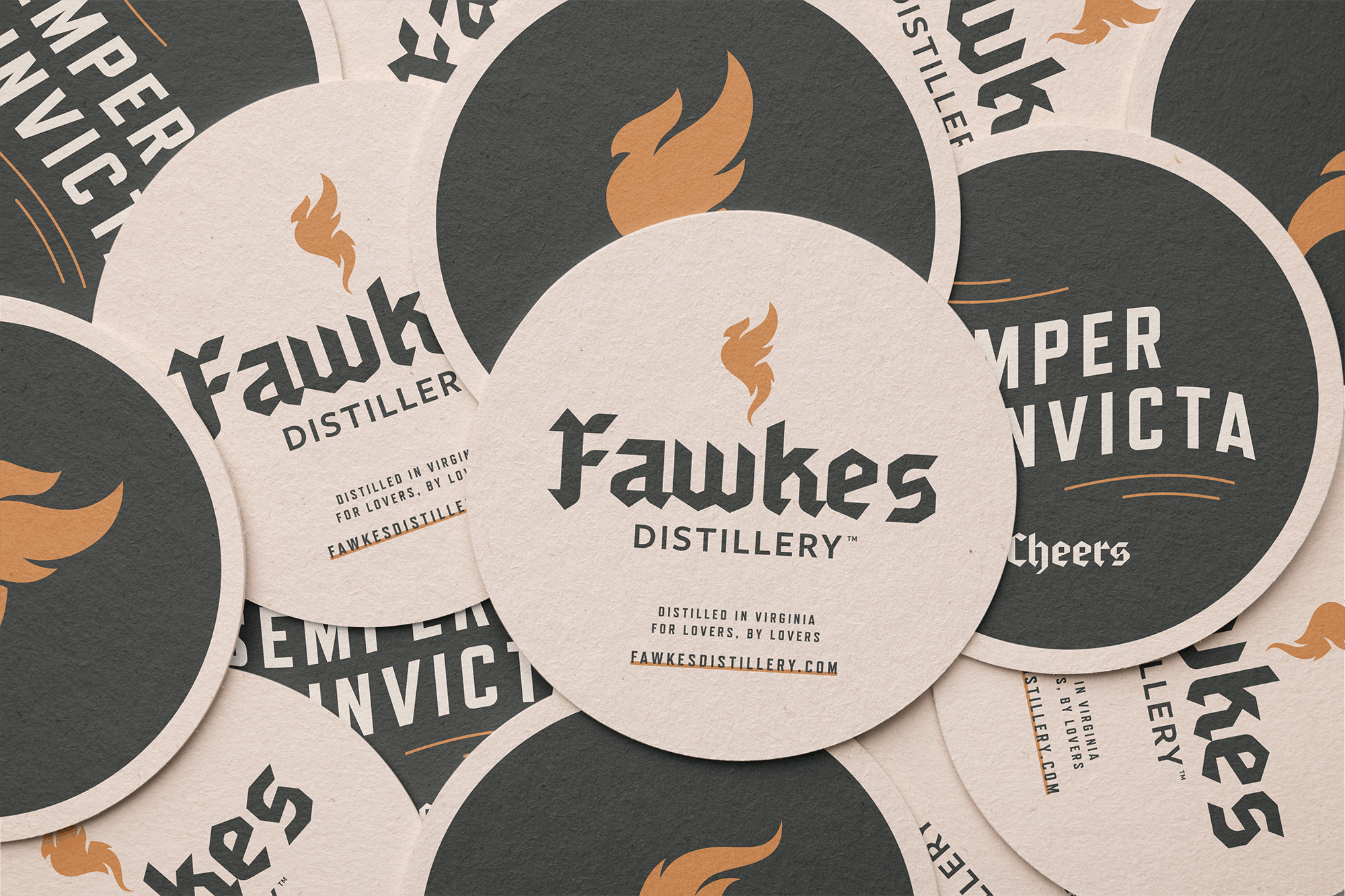
Between client assignments, Dresden Design tasked the team to create a unique branding project for their internal use. The agency’s owner had envisioned a fictional distillery named Fawkes Distillery, inspired in part by her time in England celebrating Guy Fawkes Night (also known as Bonfire Night).
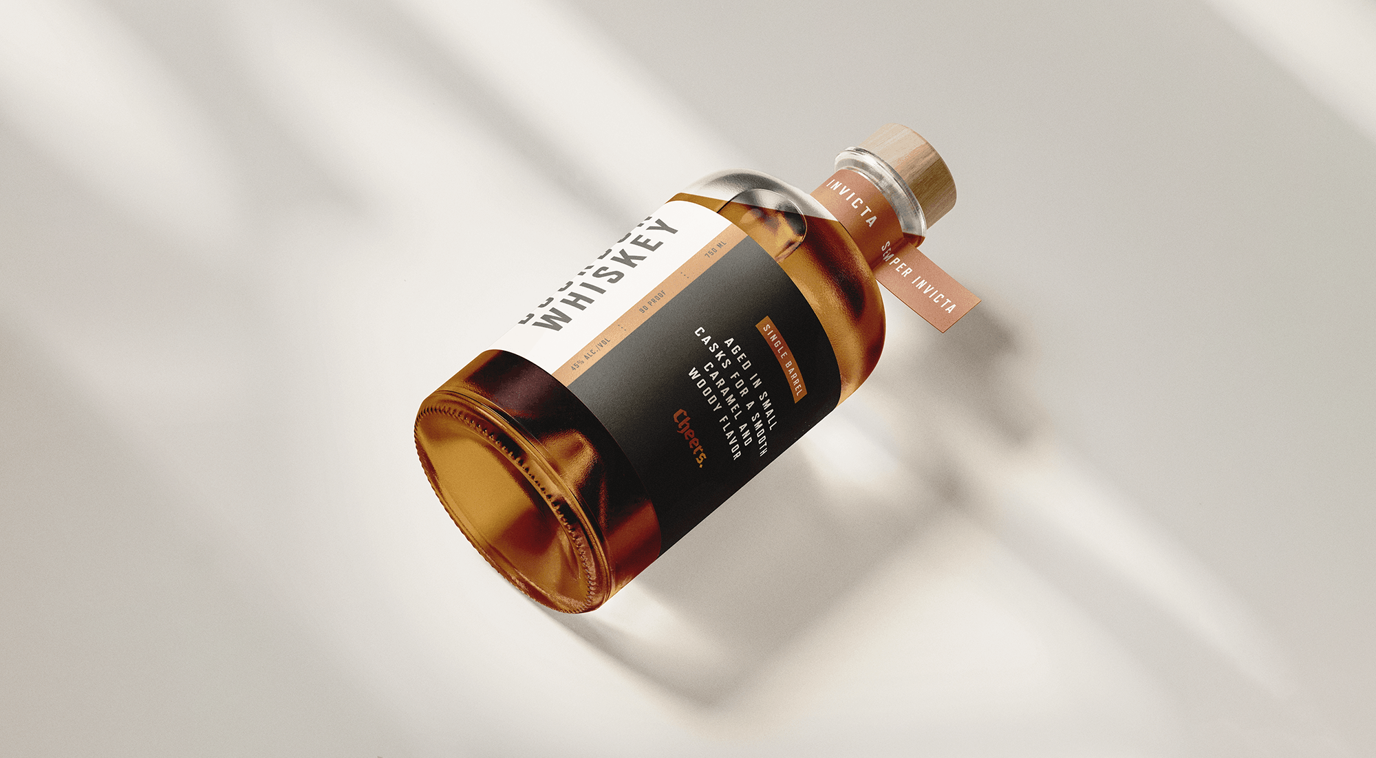
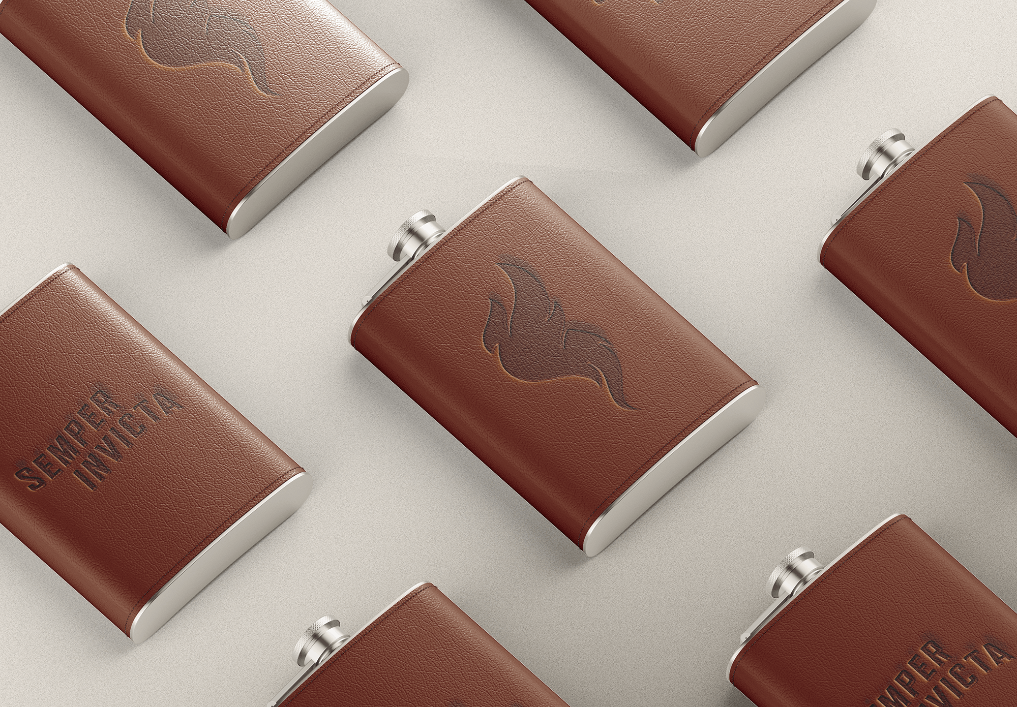
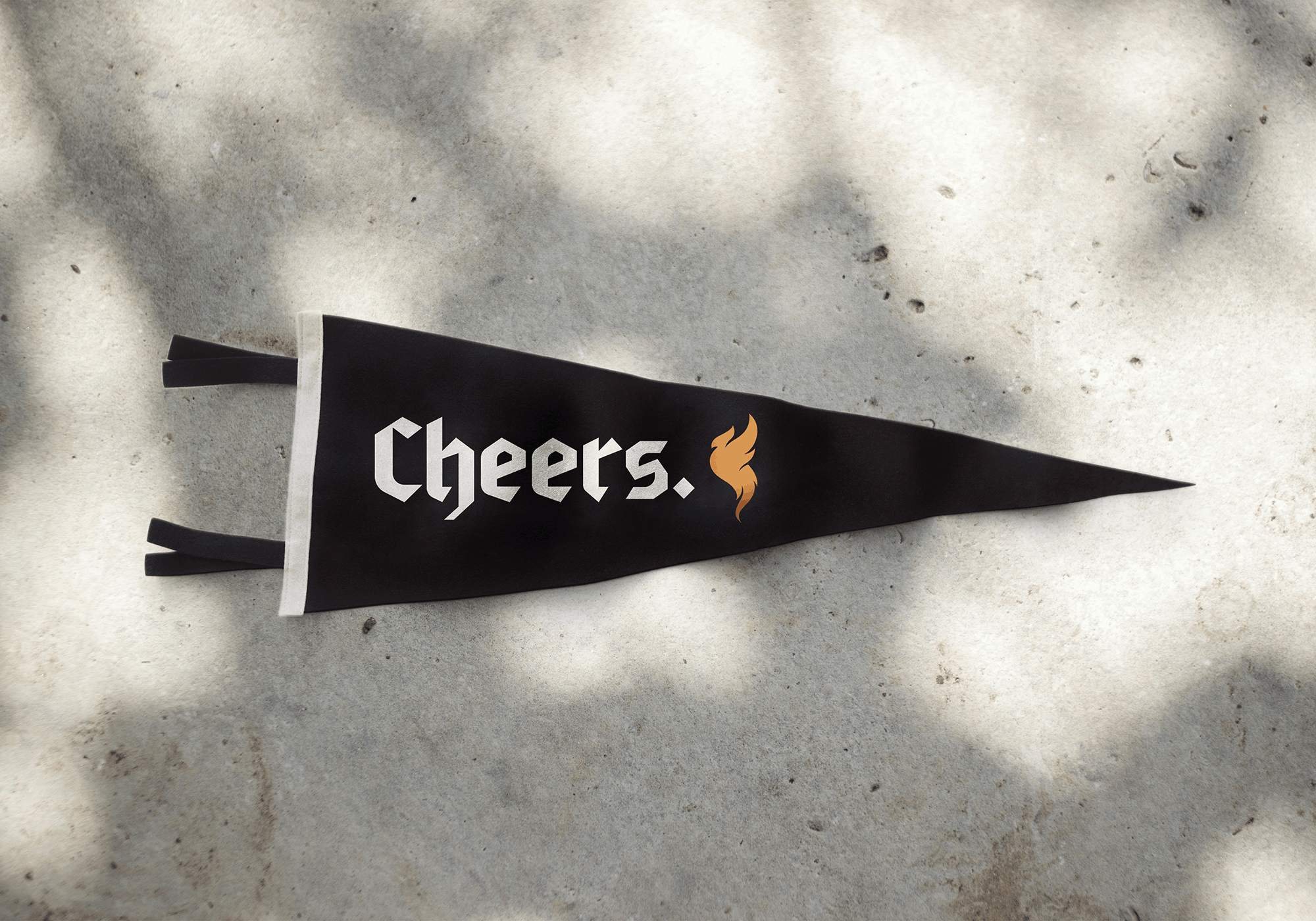
The creative brief also included a personal mantra used throughout the brand as an alternative design element: Semper Invicta—Latin for “this is not the end.”
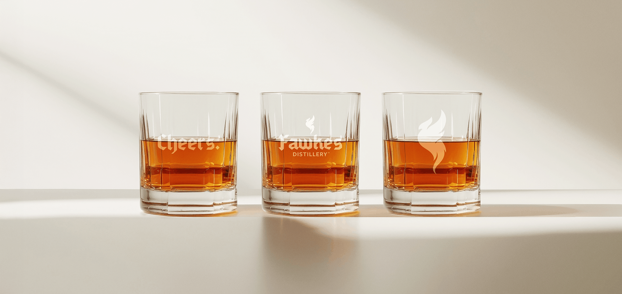
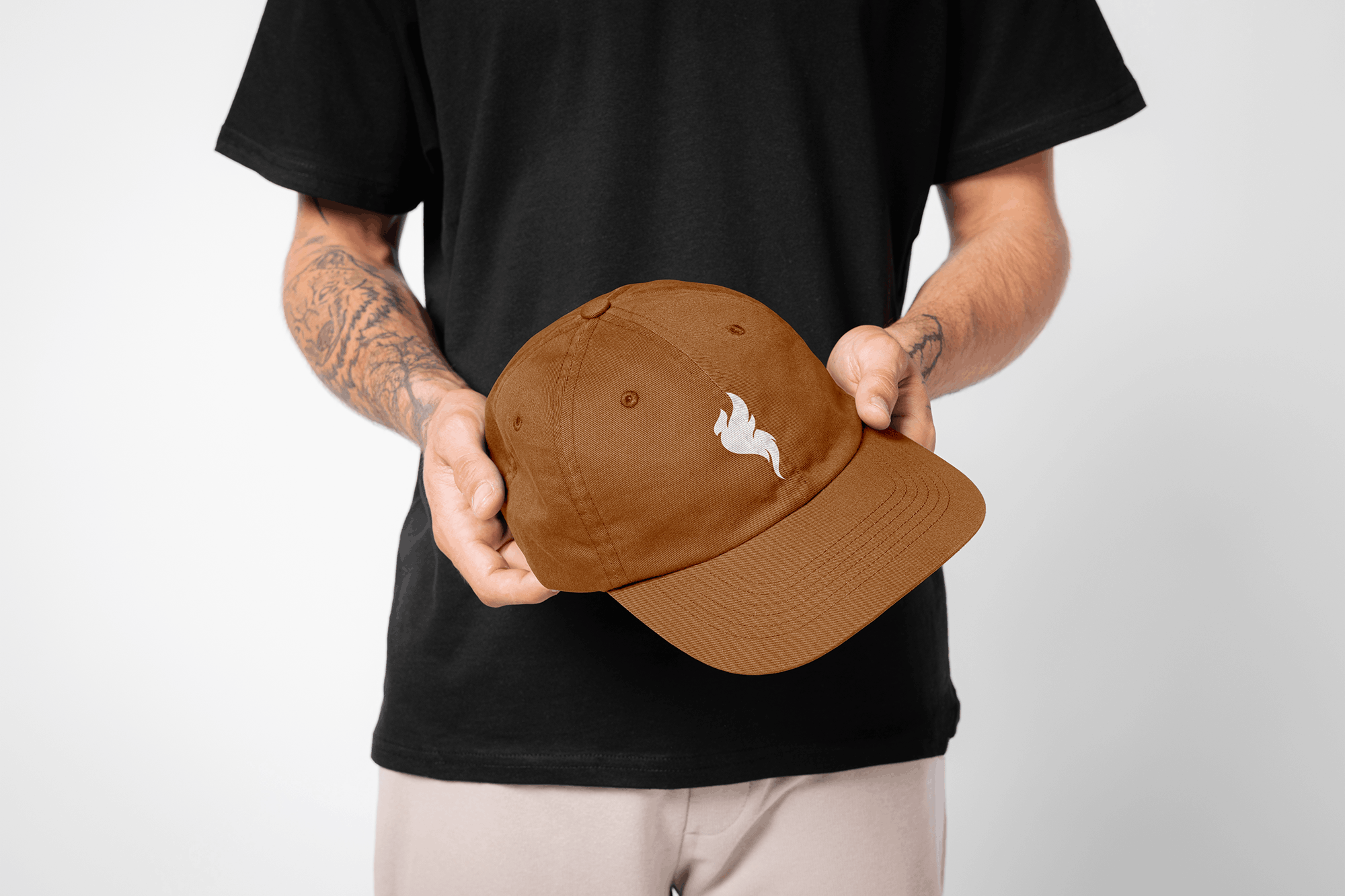
The visual identity is grounded in a rich palette of charcoal, ivory, and copper, anchored by a bold blackletter typeface. While the branding draws on historical and classical motifs, its strong angles, curves, and graphic forms give it a modern edge. The phoenix logo—shaped like a flame—subtly references the brand’s fiery origins. Any further magical associations with the bird are purely coincidental. Or perhaps, not.

Design: Sara Reitenbach
Art Direction: Sara Reitenbach
Project management: Dresden Design
Client: Dresden Design